Colors have this incredible power to change everything about a space. They can make a tiny room feel open, turn a dull one into something cozy, or even make an empty corner your new favorite spot. But let’s be honest, picking the right colors can be surprisingly tricky. One shade too cool, and your “relaxing neutral bedroom” might suddenly feel like a hospital corridor.
That’s exactly why this room color palette guide was put together: to help you choose colors that reflect your style, suit your home’s mood, and actually work in real life.
In this blog, we’ll walk through how to select the perfect palette for every room, from understanding mood and lighting to layering textures and accents the way interior designers do, without the stress.
Start with the Mood You Want
Before you even look at paint samples or Pinterest boards, pause for a sec. Ask yourself: How do I want this room to feel?
Colors aren’t just visuals. They trigger emotion. They can energize, calm, or even make a space feel “expensive” or intimate.
Think of each room like a person with its own vibe. Your bedroom might need that quiet, peaceful energy, while your living room could be more about warmth and social energy.
Here’s a quick breakdown of how color affects mood:
- Warm tones (reds, oranges, yellows): Energizing, lively, cozy.
- Cool tones (blues, greens, purples): Calm, refreshing, soothing.
- Neutrals (beige, white, grey): Balanced, timeless, grounding.
You don’t have to memorize color psychology, but understanding how shades affect your mood will save you from repainting a wall six months later. It’s a subtle art, and where choosing paint colors for home really begins.
Match Colors to the Room’s Purpose
Every room has its own rhythm. The way you use a space should absolutely guide your color choice.
For instance:
- Living Room: Think inviting. Warm undertones or soft neutrals with a pop of color help people relax and connect.
- Kitchen: This space benefits from brightness. Whites, yellows, or minty greens keep things feeling fresh and clean.
- Bedroom: Soft shades like muted blues, olive greens, or taupe help your brain slow down.
- Home Office: Neutrals or soft blues improve focus and minimize distraction.
Color should reflect function. If it’s a chill zone, go for calming tones. If it’s your creative corner, bring some life into it. It’s all about balance.
Use What You Already Have
Before you run off to the hardware store, take a walk around your space. Your furniture, rugs, and even wall art can help guide your color schemes for interior design.
If your couch leans toward earthy beige or your bedspread has deep navy tones, those are already clues. You don’t always have to start from zero; work with what’s already there.
A quick trick to remember:
Pick three key colors, one dominant, one secondary, and one accent. The dominant color sets the tone, the secondary balances it, and the accent adds personality. It keeps the design feeling intentional, not accidental.
And if you’re someone who worries about everything “matching,” don’t. Great design isn’t about perfection; it’s about flow.
Don’t Ignore the Lighting
Lighting changes everything. You can pick the perfect shade in the store, only to have it look totally different at home.
Natural light brings out the truest version of any color. Artificial light can shift the tone; some bulbs make things warmer, some cooler. So before you commit, test your top three colors at different times of day.
Here’s what you need to keep in mind:
- North-facing rooms tend to feel cooler, so warmer tones like coral, tan, or blush work best.
- South-facing rooms get strong light, so cooler shades like pale grey or soft blue balance that brightness.
- Evening light from warm bulbs can deepen colors; keep that in mind for living spaces.
Honestly, lighting is the secret weapon most people overlook when choosing paint colors for home. It’s what separates “looks nice” from “feels amazing.”
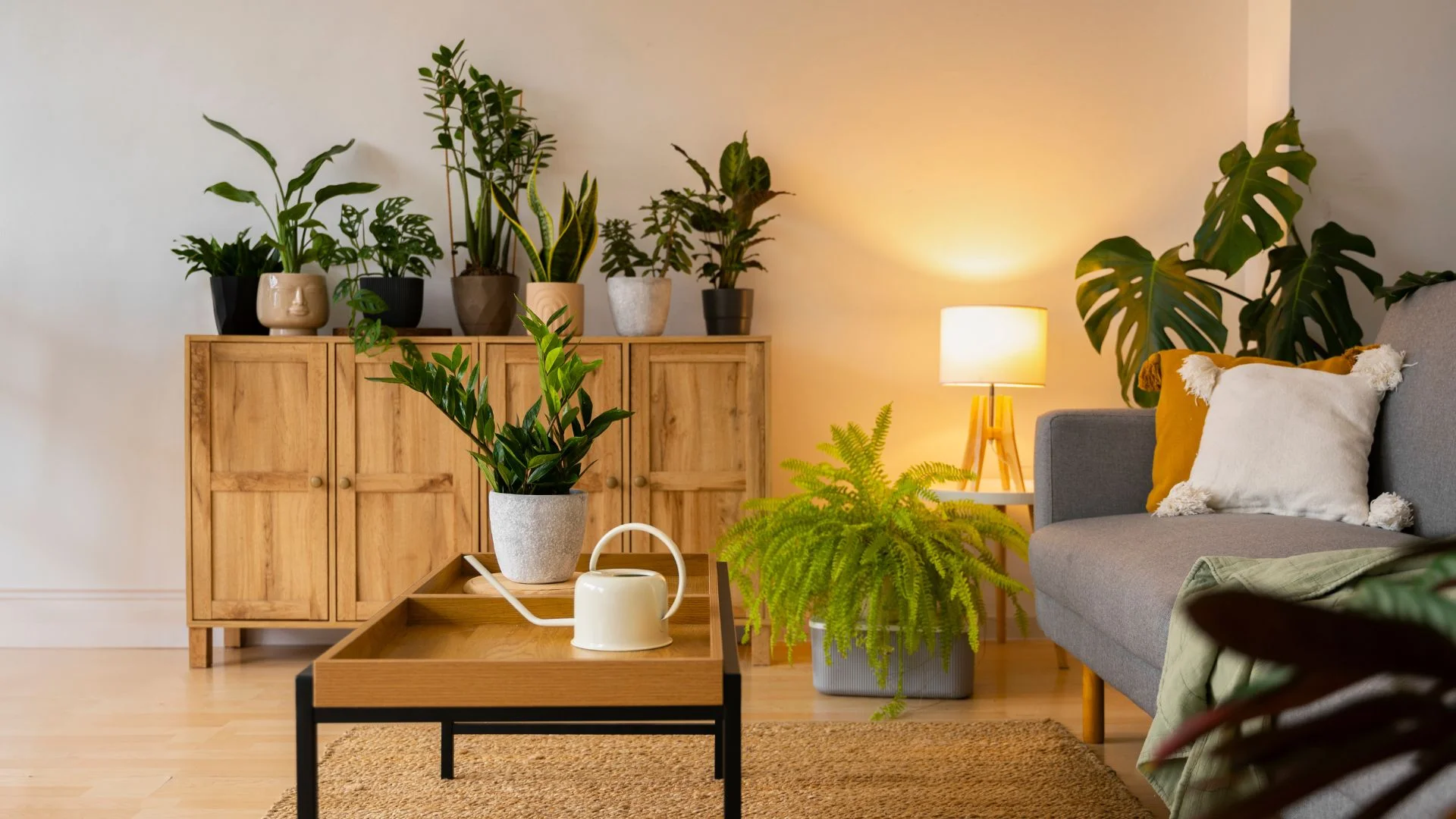
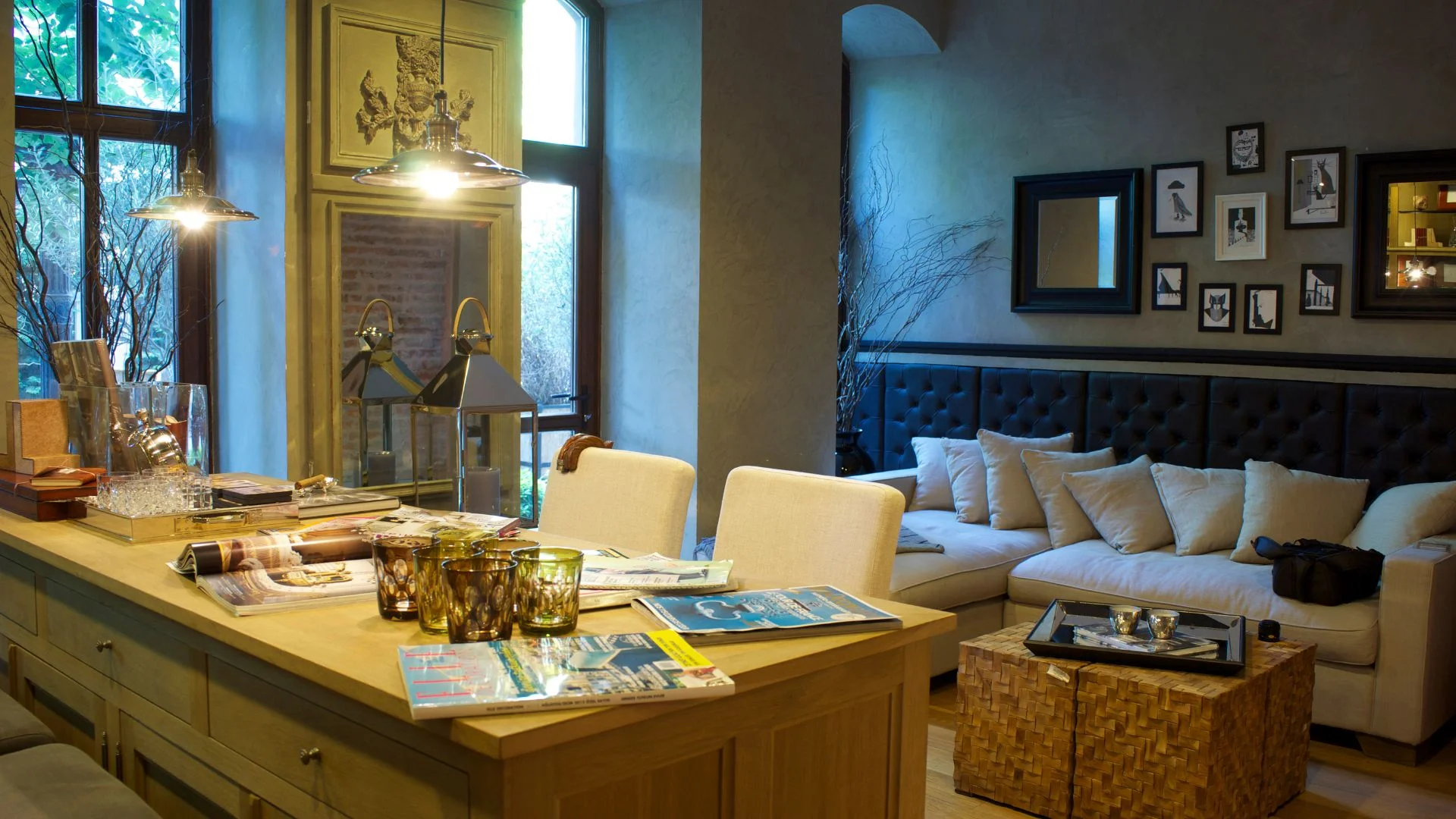
Mix Neutrals and Accents Like a Pro
Neutrals are not boring. They’re what make the whole color story come together. Once you’ve got your base, it’s time to play with accents.
Think of neutrals as the calm backdrop that lets the other shades shine. Beige walls with forest-green cushions? Gorgeous. Soft white walls with burnt-orange decor? Instant warmth.
A good go-to combo:
- Base: A neutral like cream, white, or soft grey.
- Secondary: Something earthy like sage or charcoal.
- Accent: A bold pop, think rust, teal, or navy.
This approach makes your space feel layered and intentional. It’s not about filling every corner with color; it’s about knowing when to stop.
Keep the Flow Between Rooms
A home looks best when its rooms feel connected but still unique. You don’t want every space to look identical, but a little continuity helps everything flow naturally.
Try repeating one tone throughout the house. Maybe your living room cushions echo the same dusty pink that appears in your hallway art, or your kitchen stools subtly pick up the same tone as your bedroom throws. It’s those little links that make your design cohesive.
A simple trick: use one consistent neutral as a base, then let each room have its own personality through accents or materials. This is a small detail that makes a huge difference in your overall color schemes for interior design.
Don’t Forget Texture and Finish
Color alone doesn’t tell the full story; texture and finish matter too. They influence how light bounces off the surface and how a room feels in person.
- Matte finishes feel soft and luxurious, but are a bit tricky to maintain.
- Satin or eggshell finishes are great for living spaces, durable but still elegant.
- Glossy finishes work best for trims, cabinets, or details you want to highlight.
Also, think beyond paint. Pairing color with materials like wood, stone, or velvet gives the space depth. For example, a sage-green wall next to brass fixtures creates a totally different vibe than the same color beside white furniture.
Let Your Style Lead the Way
Here’s the part most people overthink: choosing paint colors for home doesn’t have to feel like a science project. Your home is yours, and if you love it, that’s what really matters.
If you’re torn between two shades, test both. Live with them for a few days. Notice how they look in the morning light and again at sunset. Sometimes your instincts know more than the color wheel ever could.
Colors aren’t permanent. You can always change them. The real goal is to make your space feel good, not just look “designer perfect.” This room color palette guide is simply a framework to help you get there.
Conclusion
At its core, picking the perfect palette isn’t about following trends or copying what you see online. It’s about creating a space that feels like you. Start with the mood, consider the light, and let your instincts do the rest.
Remember, the right colors can completely transform how you live in your space. A good room color palette guide helps you express your personality, not just paint your walls, and understanding color schemes for interior design makes that transformation even more effortless and cohesive.
At CasaKaya, we turn ideas into beautifully designed spaces. From picking your first swatch to building a full interior story, we’ll help you find the perfect color palette for every room, because your home deserves to look its best.